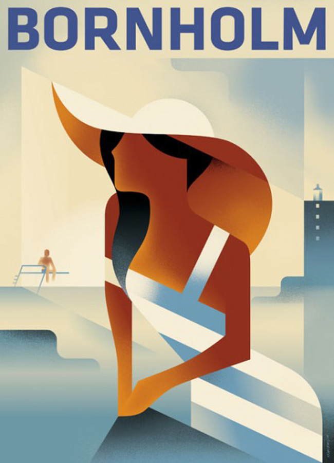
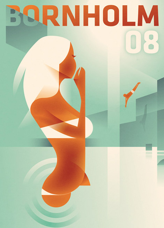
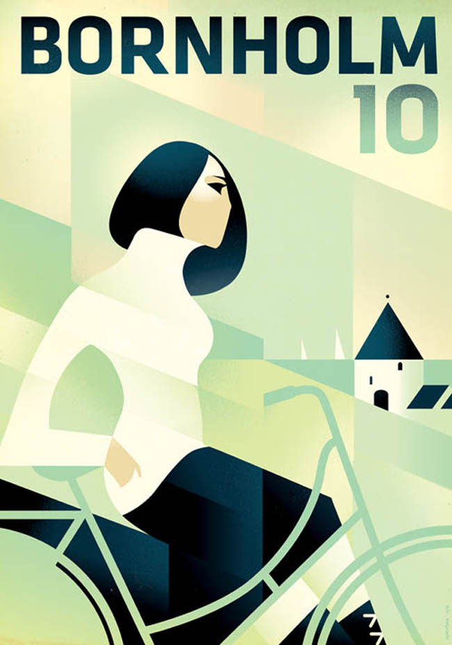
Mads Berg is a graphic designer I have stumbled over recently in several art online mags. What captured my attention directly was his unique approach with colors and forms. I felt instantly remembered to one of my favorite painters of all time: Tamara de Lempicka – but his interpretation of forms is very unique and modern, too. I contacted Mads and he agreed to do this interview with me in order for the Musetouch readers to learn more about him and his stunning work.
First of all I would like to know a bit more about yourself. Who is Mads Berg – where are you from?
I am living, loving and working in the capital of Denmark, Copenhagen with my wife and three kids. Creativity has always been a great and inspiring companion in my life, and this urge for expressing myself creatively combined with a passionate interest in art led me to illustrate. My great interest is particular in ancient and modern art, and the inspiration I collect from that is really what fuels my fire and makes me want to express my work through illustrations.
Looking at your work, one cannot help but feel that you must have a great love for art deco and vintage graphics in general. What / who is your greatest inspiration and how come?
Actually I have a greater love for the cubists like Juan Gris and Georges Braque. Cubism really fascinates me. It makes the art look very simple, however, it adds a very cool and complex dimension to it as well.
What are your current projects / what are you working on at the moment?
At the moment I’m working on brand images for both a Danish and French beer company. A British Paper Company and then I’m doing a t-shirt design and a poledancer logo!
What / Who would be your ideal project to work in? Is there something like a dream customer that you would love to work for?
It would be amazing to do murals for Tivoli in Copenhagen or the Empire State Building. Wow.
Nini Baseema
